Ever typed something and wondered, “Should I put one space or two after a period?” It’s a question that sparks debate, and surprisingly, has a fascinating history rooted in the machines of yesteryear!
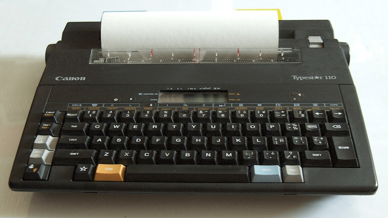
For over a century, the two-space rule was king, all thanks to the trusty typewriter. Early typewriters used what we call “monospaced” fonts, meaning every letter, whether it was a skinny ‘i’ or a wide ‘W’, took up the exact same amount of horizontal space.
Because every character was the same width, a single space after a period often looked too small. It didn’t visually separate sentences enough, making text harder to read. Adding a second space created that crucial, clear gap between sentences, improving readability.
Fast forward to the digital age, and things changed dramatically. We moved from typewriters to computers, and from monospaced fonts to “proportional” fonts. In proportional fonts, like the ones you’re reading now, letters take up only the space they need. An ‘i’ is narrower than a ‘W’.
Modern word processors and design software automatically handle spacing, making one space after a period perfectly sufficient and visually balanced. In fact, most style guides, including the Associated Press and the Chicago Manual of Style, now recommend a single space.
So, while the two-space habit made perfect sense in the era of typewriters, it’s largely obsolete today. Most designers and typographers agree that a single space is not only cleaner but also the correct modern practice. It’s often just a hard habit to break!